![logo icon white.png]](https://help.hijiffy.com/hs-fs/hubfs/logo%20icon%20white.png?width=50&height=50&name=logo%20icon%20white.png)
You can customize several aspects of the chat widget to ensure it fits your brand and website. Current customizable options are:
To learn more about the Widgets menu, click here
Widget
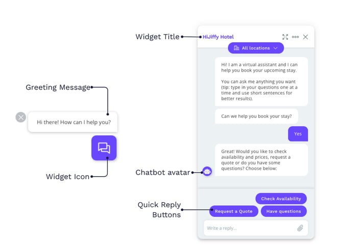
See below the widget display when it is close and open.
You may need to refresh your website to see the changes.
Greetings and Title
The Greeting & Title settings allow you to customize the initial message and branding guests see when they interact with your widget. By tailoring these fields, you can ensure a consistent brand voice and provide a warm, multi-lingual welcome to every visitor, regardless of their device or language.
Greeting message
- The greeting message is a small popup that appears above your widget after 5 seconds on the website to increase awareness that the chat is available.
- It only appears to new website visitors who haven't interacted with the chat before.
How to change the greeting message
To change the greeting message text:
- In the Console, go to the 'Widget' section
- Select the specific widget you wish to edit
- Click on the Greeting & Title tab
- Select the specific Language tab
- In the Greeting message text box, enter your desired text in each language
- Click Save changes.
Use the Desktop and Mobile toggles at the top to enable or disable the message for specific device types

Widget Title
The widget title is the heading shown to users at the very top of the chat window during a conversation.
Note: This is different from the Widget Name, which is your internal designation used for organization in the Inbox and Reports. The Widget Title is what the users actually see.
How to change the widget title
- In the Console, go to the 'Widget' section
- Select the widget you want to update
- Navigate to the Greeting & Title tab
- Choose the appropriate Language tab for the translation you are editing
- In the Widget title box, type the name you want users to see
- Click 'Save changes'.
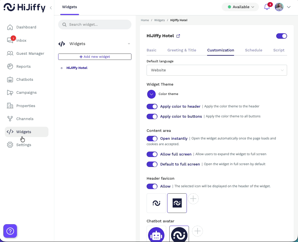
Customization
The Customization tab is where you define the look and feel of your chat widget. By aligning the colors, icons, and positioning with your hotel’s brand guidelines, you create a seamless and professional experience for your website visitors.
Default Language
The Default language setting determines which language the widget uses when a user first arrives. You can choose to have the widget automatically detect the user's language or force it to match your website's settings.
How to change the default language
-
In the Console, go to the Widget section
- Select the widget you want to update
-
Click on the Customization tab.
-
Locate the Default language dropdown at the top of the page.
-
Select your preferred detection method:
-
Browser: The widget will detect the language settings of the guest's internet browser (e.g., if their browser is set to French, the widget appears in French)
-
Website: The widget will match the language currently active on your website
-
-
Click Save changes at the bottom of the page.
Note: For these settings to work effectively, ensure you have provided translations for all your active languages in the Greeting & Title tab.
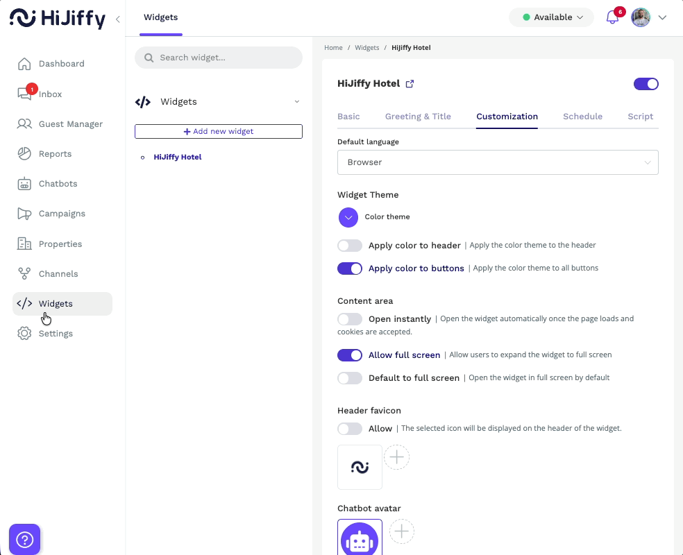
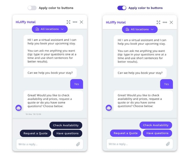
Widget theme
The Color theme is the primary visual element of your chat widget. This color is applied to the floating widget icon, the greeting message popup, the widget title bar, and the user's own message bubbles.
How to change the widget main color
- In the Console, go to the Widget section
- Locate and select the widget you wish to customize
- Go to the Customization tab
- Select your desired brand color or enter a specific Hex code for an exact match
- (Optional) Toggle Apply color to header and Apply color to buttons if you want the theme to extend to those specific areas
- Click Save changes at the bottom of the page.
Visual Comparison: Check out the screenshots below to see the difference between a standard widget and one with the "Apply color to buttons" setting enabled.
Widget behaviour
In the Customization tab, you can control how the widget appears and behaves. These settings help you define when the widget opens and how users can interact with it.
Available options
- Open instantly
Automatically opens the widget once the page loads and cookies are accepted - Allow full screen
Lets users expand the widget to full screen - Default to full screen
Opens the widget in full screen by default
How to update widget display settings
- In the Console, go to the Widget section
- Select the widget you want to edit
- Open the Customization tab
- Adjust the desired toggles under Content area
- Click Save changes
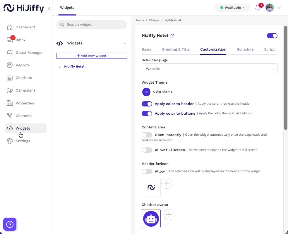
Header favicon
The header favicon is the icon displayed in the widget header. It helps reinforce brand recognition and makes the widget more visually consistent with your website.
How to enable the header favicon
- In the Console, go to the Widget section
- Select the widget you want to edit
- Open the Customization tab
- In the Header favicon section, toggle Allow
- Click the upload button to add a new image and select it after upload, or choose one of the existing images available
- Click Save changes

Chatbot avatar
The chatbot avatar is the image displayed alongside messages sent by your chatbot.
It can be your company’s logo or a generic assistant avatar, depending on how you want your chatbot to appear to users.
How to change the chatbot avatar
To update the chatbot avatar:
- In the Console, go to the Widget section
- Select the widget you want to edit
- Open the Customization tab
- In the Chatbot avatar section:
- Click the upload button to add a new image, then select it
- Or choose one of the existing avatars available
- The selected avatar will be highlighted with a blue border
- Click Save changes
You can upload images in the formats PNG, JPG, GIF, or SVG.
Widget Icon size and shape
You can customize the size and shape of the widget icon to better match your brand and website design.
How to change the icon size and shape
- In the Console, go to the Widget section
- Select the widget you want to edit
- Open the Customization tab
- In the Icon size section, choose one of the available sizes (3 options)
- In the Icon shape section, select one of the available shapes:
- Circle
- Square
- Speech bubble
- Click Save changes

Widget icon
The widget icon is the first element visitors see when accessing the chat on your website.
It should clearly communicate the purpose of the widget. We recommend using a speech bubble icon or an assistant avatar to make it immediately recognizable.
How to change the widget icon
- In the Console, go to the Widget section
- Select the widget you want to edit
- Open the Customization tab
- In the Widget icon section:
- Click the upload button to add a new image, then select it
- Or choose one of the existing icons available
- The selected icon will be highlighted with a blue border
- Click Save changes
You can upload images in the formats PNG, JPG, GIF, or SVG.

Widget position and alignment
You can control where the widget appears on your website, how it is aligned, and how it behaves on mobile devices.
These settings help you adapt the widget layout to different screen sizes and ensure a consistent experience across desktop and mobile.
How to change the widget position and alignment
- In the Console, go to the Widget section
- Select the widget you want to edit
- Open the Customization tab
- In the Alignment section, choose the widget alignment:
- Left
- Right
- In the Position section, choose where the widget appears on the page:
- Standard
- Bottom
- Top
- Custom
- Click Save changes
Mobile positioning settings
You can also customize how the widget appears on mobile devices.
- Enable Custom Mobile Positioning using the toggle
- When enabled, you can configure:
- Widget mobile alignment (Left or Right)
- Widget mobile position (Standard, Bottom, Top, Custom)
- Widget size for mobile devices
- Click Save changes
Desktop:
Mobile:
